A new UI direction for a refreshed brand
Aims
- Convey stability and robustness
- Feel familiar and friendly
- Use design to reduce visual noise
- Reflect the Cirro brand
Audience
- Enterprise customers
- Touch and desktop users
Situation
Cirro had three user-interface styles and was in the process of refreshing their brand.
Approach
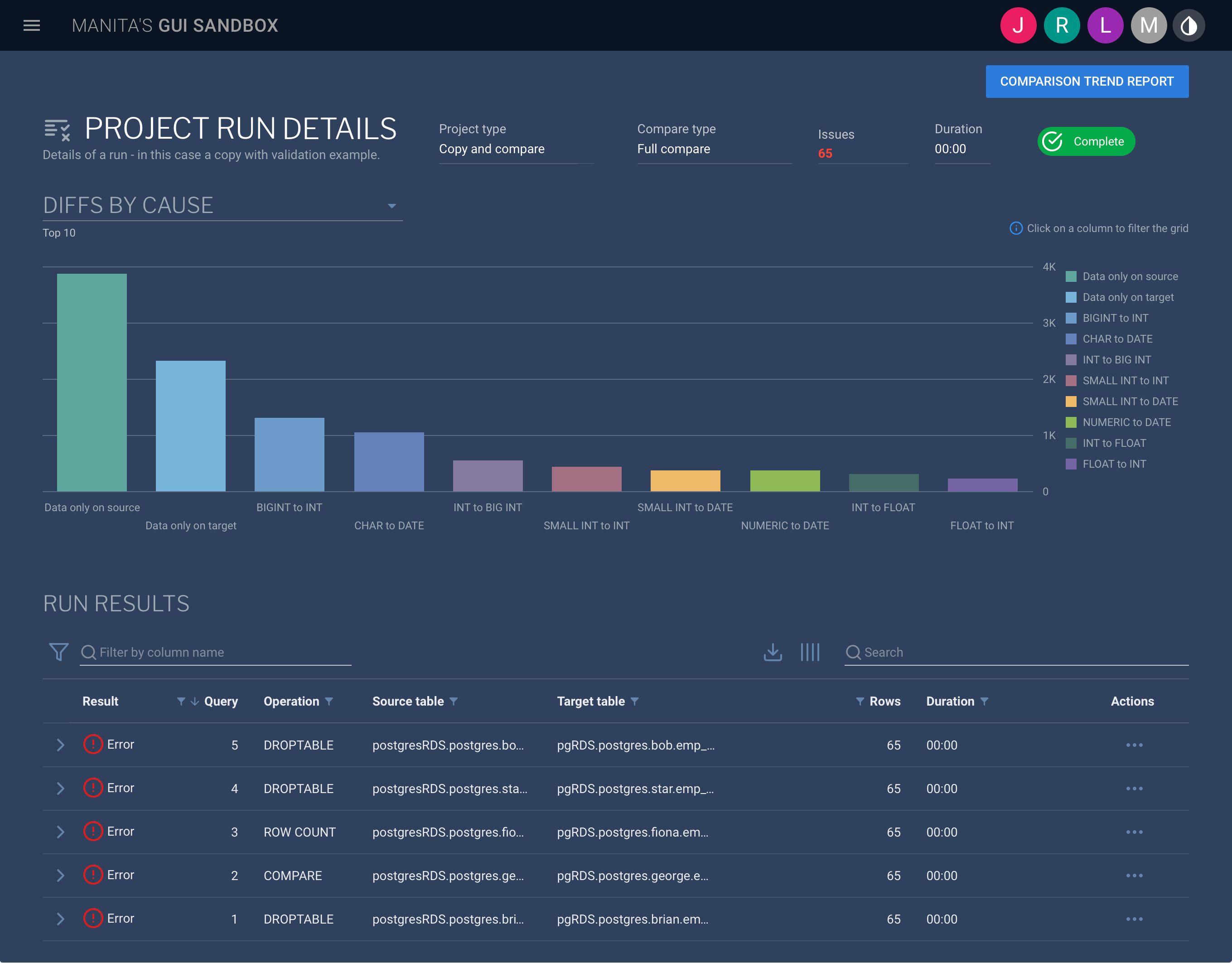
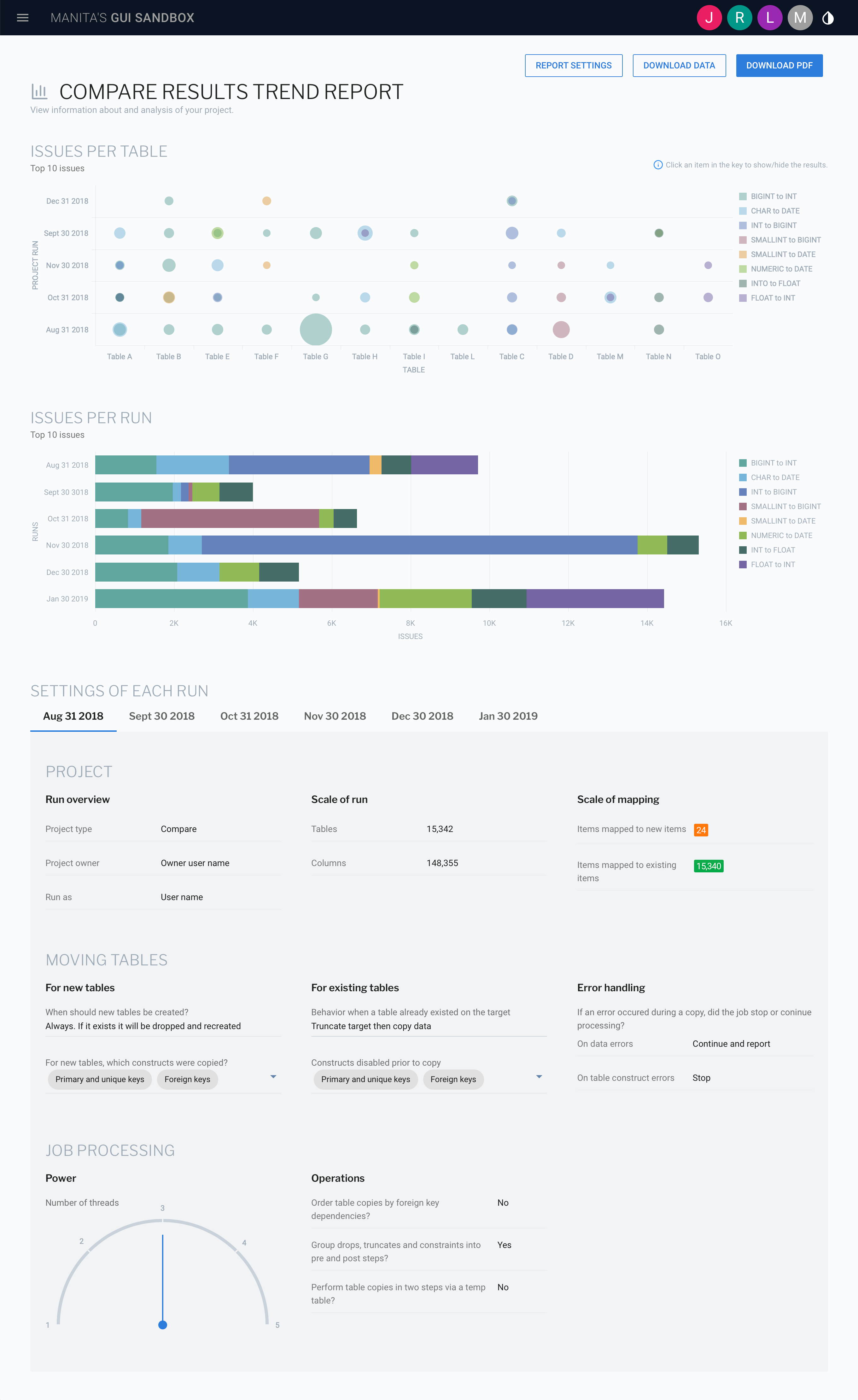
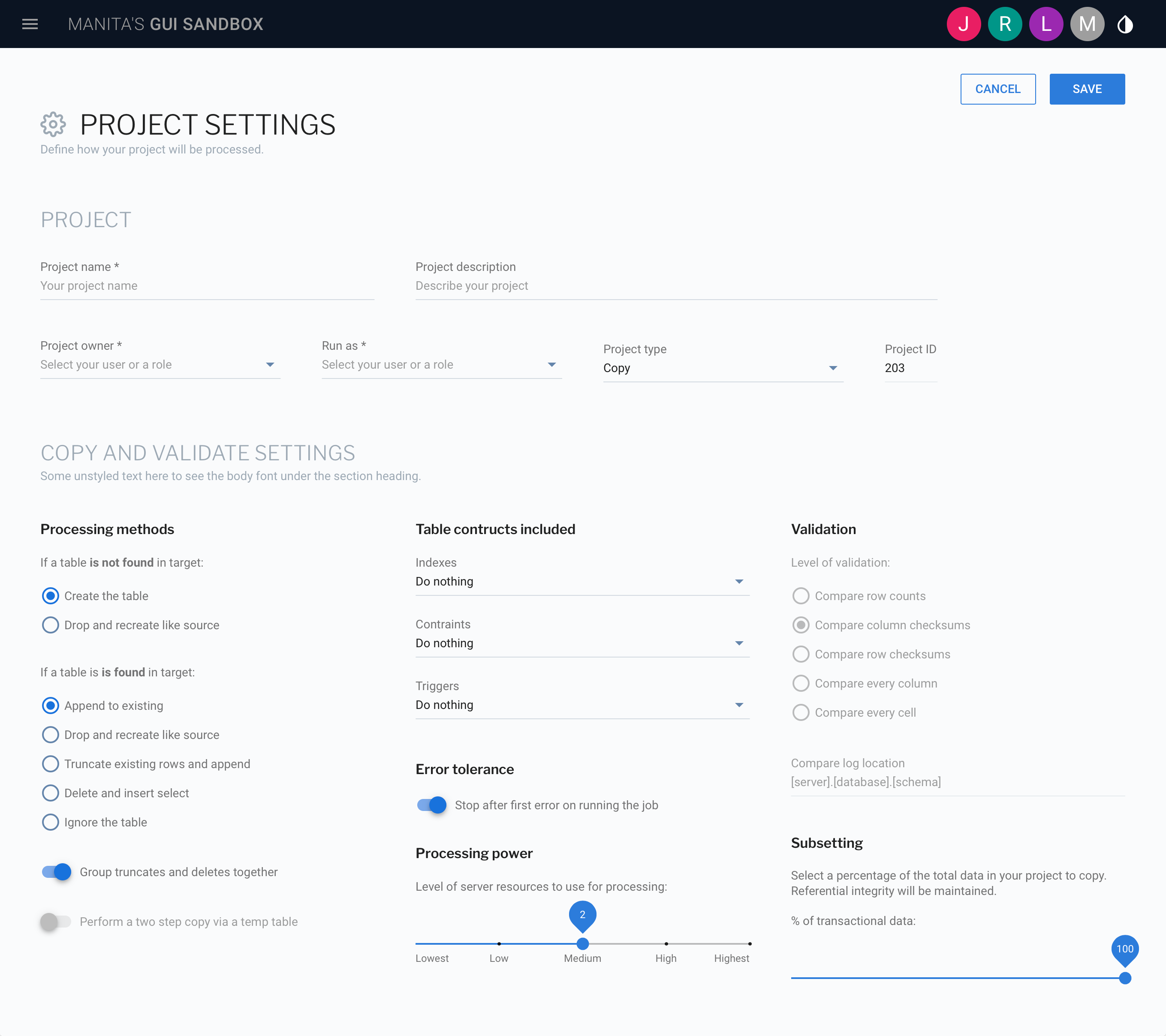
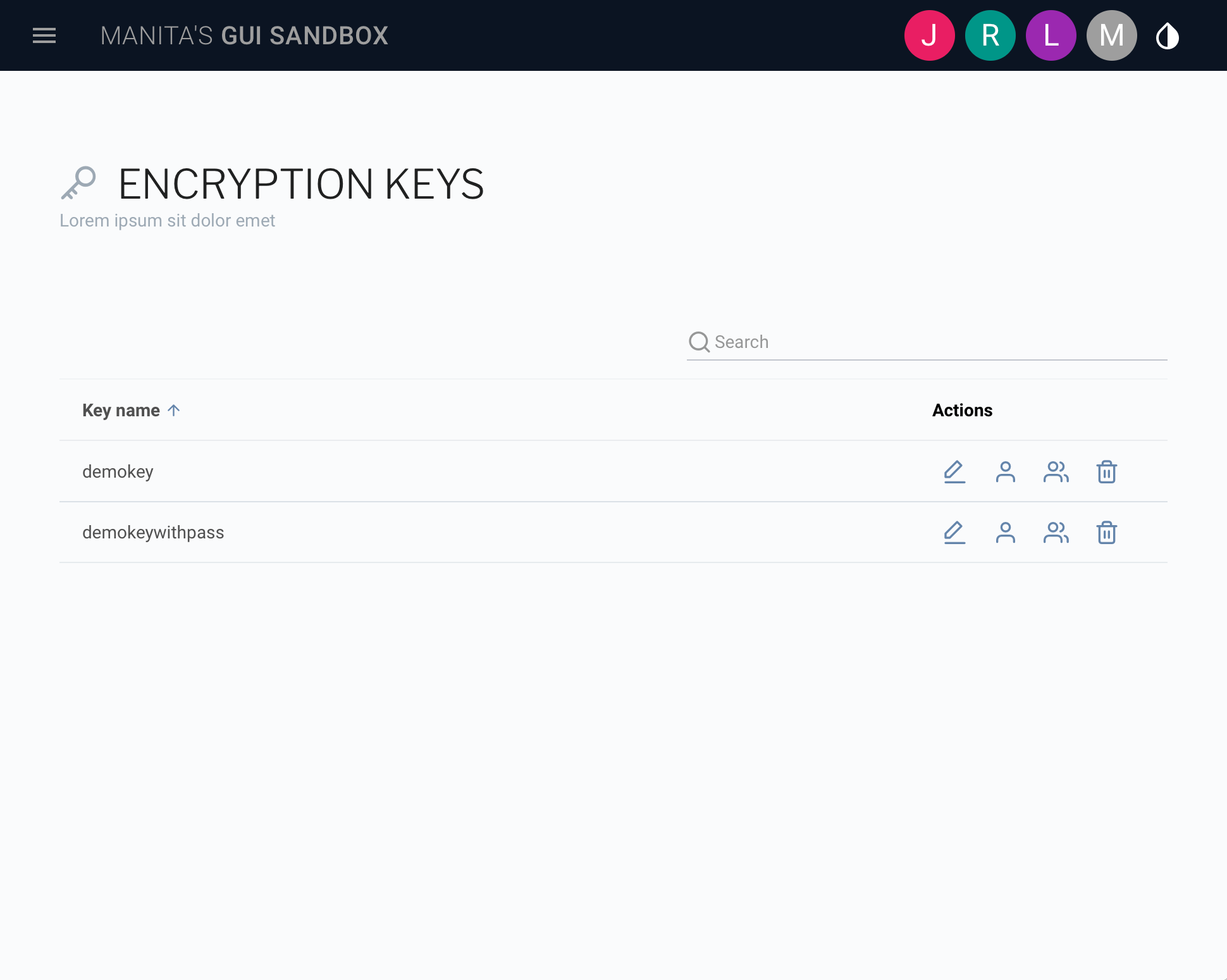
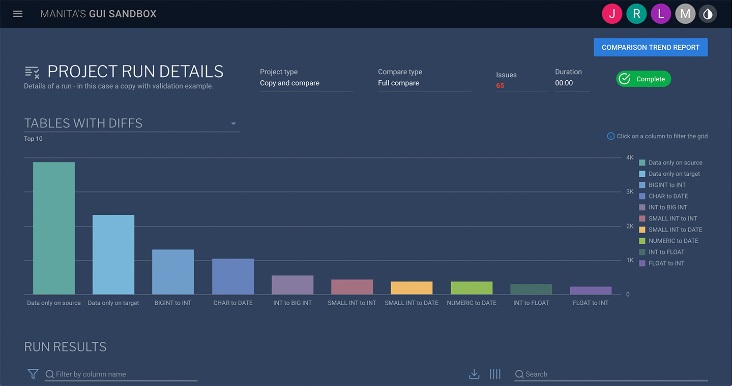
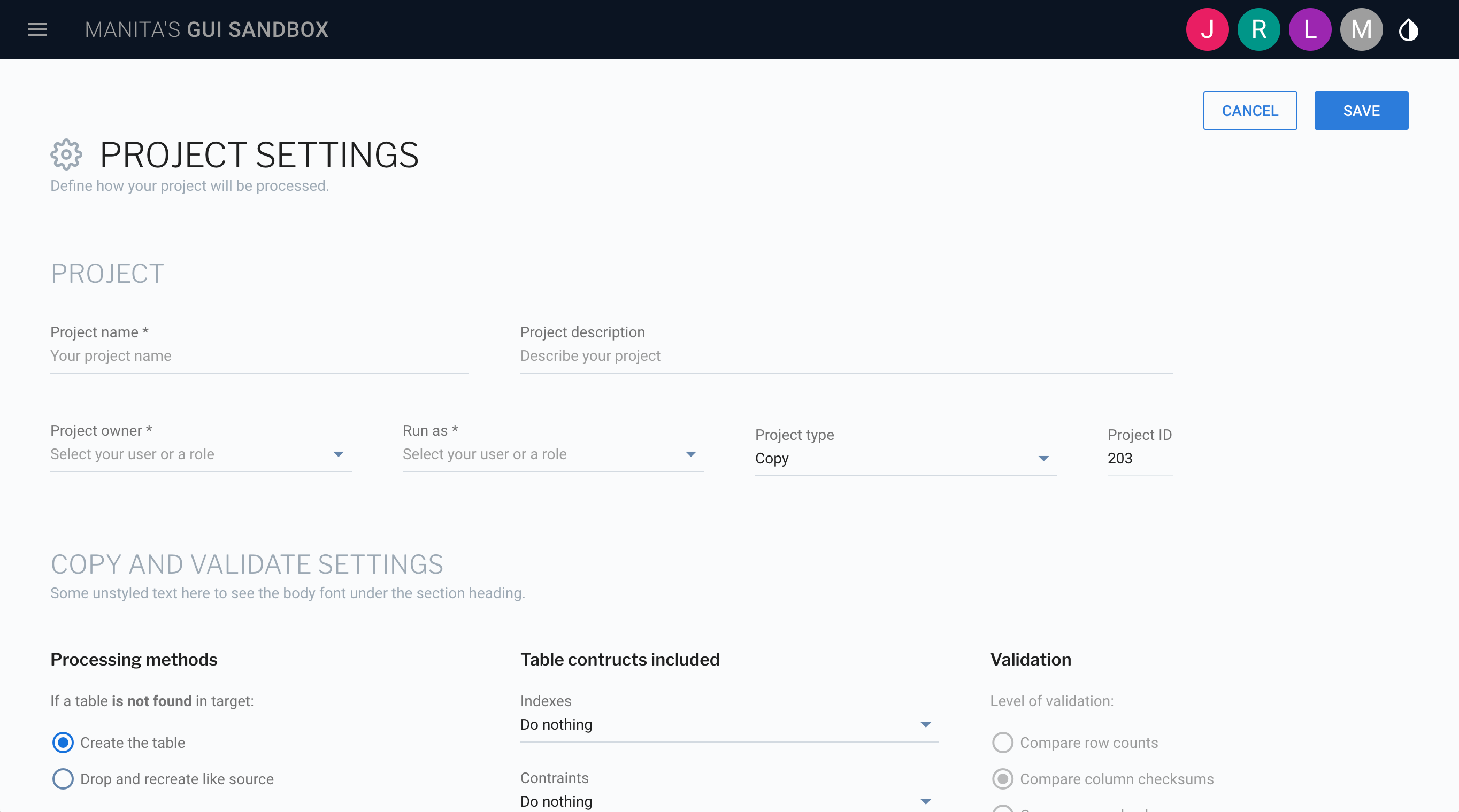
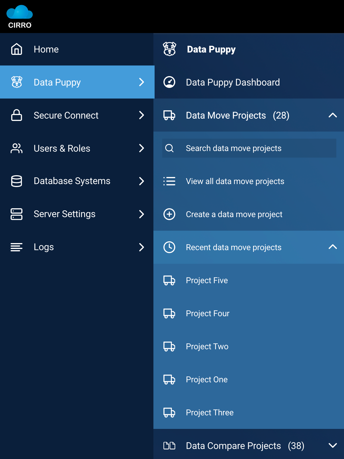
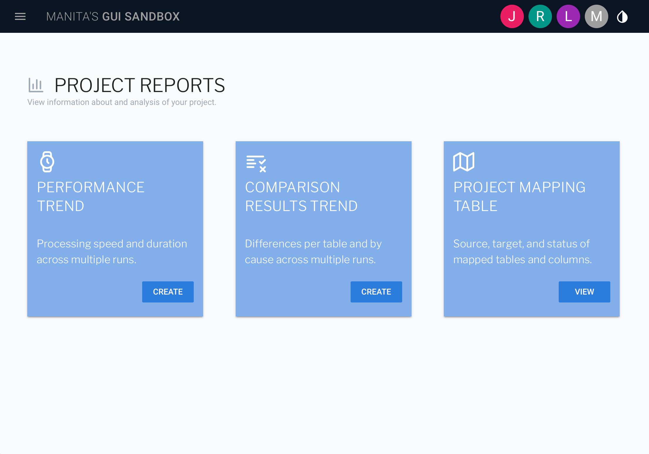
We took the new brand and chose a GUI design direction. Then we designed key pages to firm up our style choices. Once this was complete, we rolled out styles and began a custom component set using the Vuetify component library in the Vue.js framework.
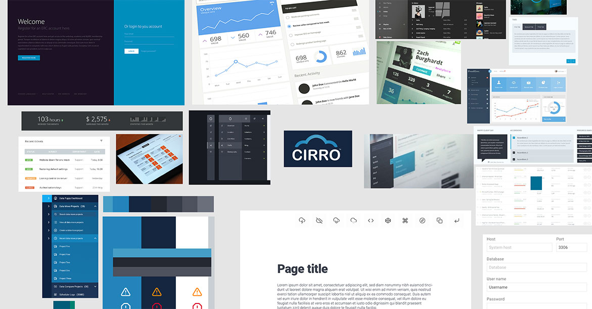
The images below show all phases of this work and all the images are of my original works, the moodboard contains screen grabs of inspiration.
Client:Cirro
Role:User Experience Design and Graphic User Interface Design
Product:Web Application
Site:www.cirro.com
Making it easier for the team to adopt new designs.
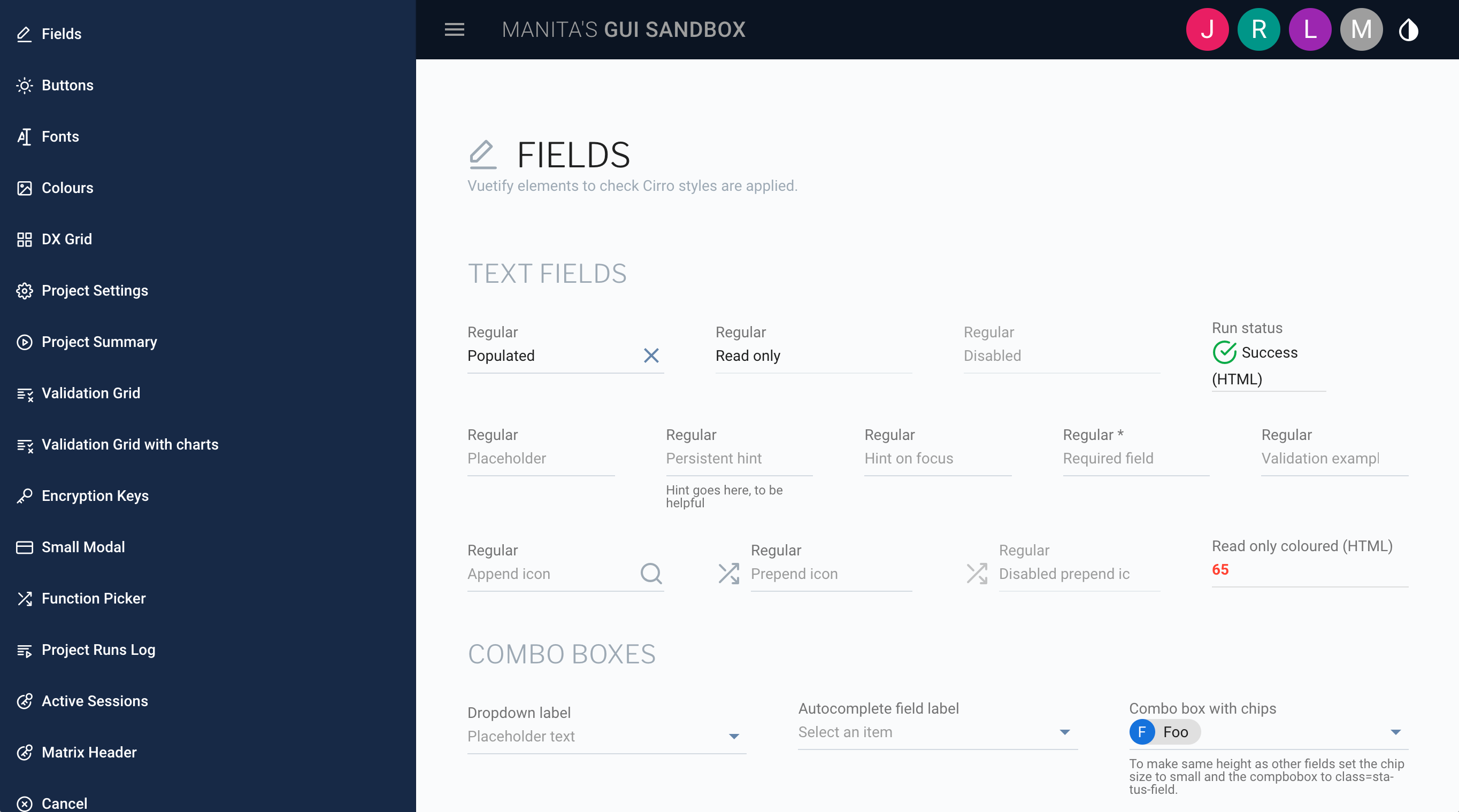
We had three soon to be legacy UIs and a dispersed team in five time-zones, which made finding a no-fuss way for our Engineers to adopt a new GUI direction crucial. When the team chose to build UIs with Vuetify, a Material Design toolkit for Vue.js, I used it to build a UI style library.
The style library contains a set of page examples, page templates, and components styled to match our designs. When we added a powerful grid and chart component, I styled the grid to match too.
Sample pages
