
Moving an enterprise behemoth to a web UI
FlexNet Manager Suite for Enterprises is a powerful system, used by hundreds of large organizations, to maintain continuous software license compliance.
FNMS interrogates networks to measure software license consumption while users enter and track software contracts and software lifecycles to reduce risk, and optimize software spend.
I was hired to reimagine the User Experience and UI Design of FNMS as it was being moved from a desktop UI to web.
FNMS won the CODiE award for best asset management solution prior to and after, the very successful redesign.
It continues to be recognised today, Gartner Peer Insights Customers’ Choice for Software Asset Management Tools.
Client:Flexera Software
Role:User Experience and User Interface Design
Product:Enterprise System
Site:www.flexera.com
Approach to designing the FNMS web UI
Here's the approach I used to appraise, prioritise, create buy-in, share, and deliver, the UX for an enterprise application with hundreds of pages and a team of about 50 people.
-
Review of the
existing UII observed users performing key tasks with the desktop application, talked to customers about satisfaction, and surveyed the product team to identify strengths and issues.
-
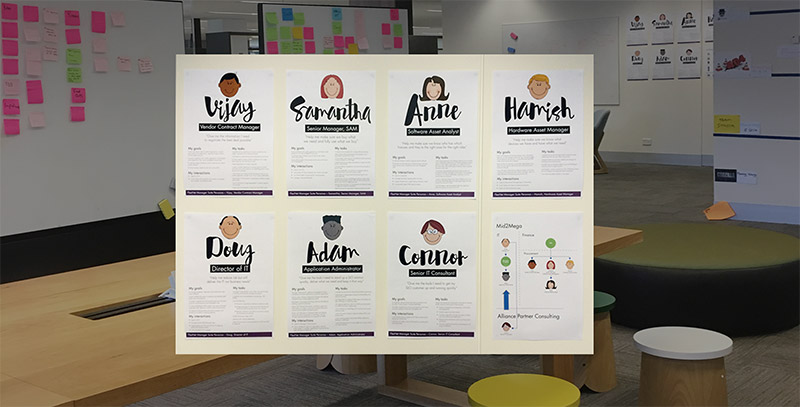
Personas
I worked with Product Management, Documentation, and Sales to create personas. Over time, these were used throughout the team when referring to users including in; testing, research, user stories, and bugs.
-
Information Architecture
I ran a Card Sorting Workshop with the whole product team to gather the top few tiers of the Information Architecture and understand how people think the topics and tasks relate.
-
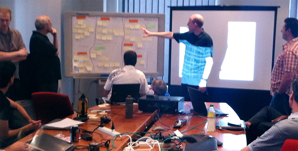
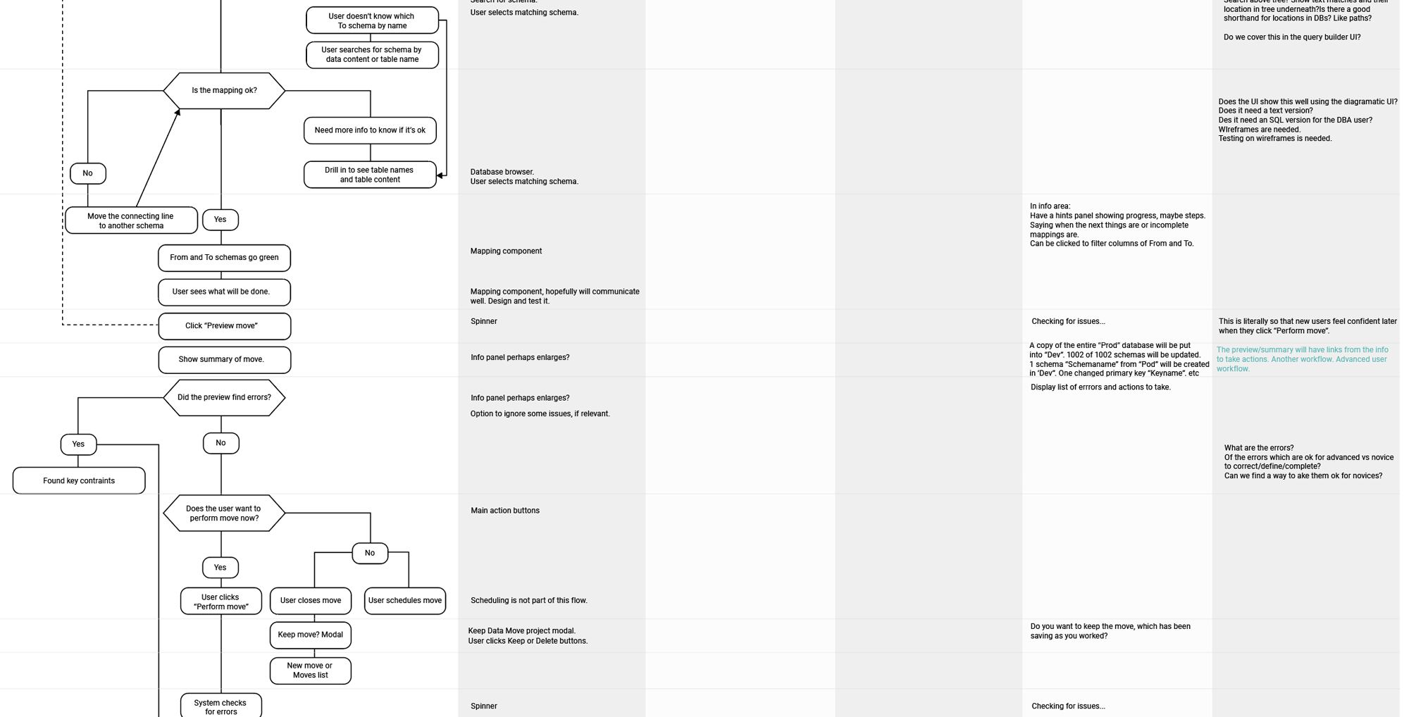
Workflows
Many people had developed habits by using the desktop version of the product, so I focussed on smoothing any problematic workflows and minimising the impact of change.
-
Design principals
Understanding the scale of the app and the tasks users performed lead to principals we could apply throughout the UI design process, including; progressive disclosure and management by exception.
-
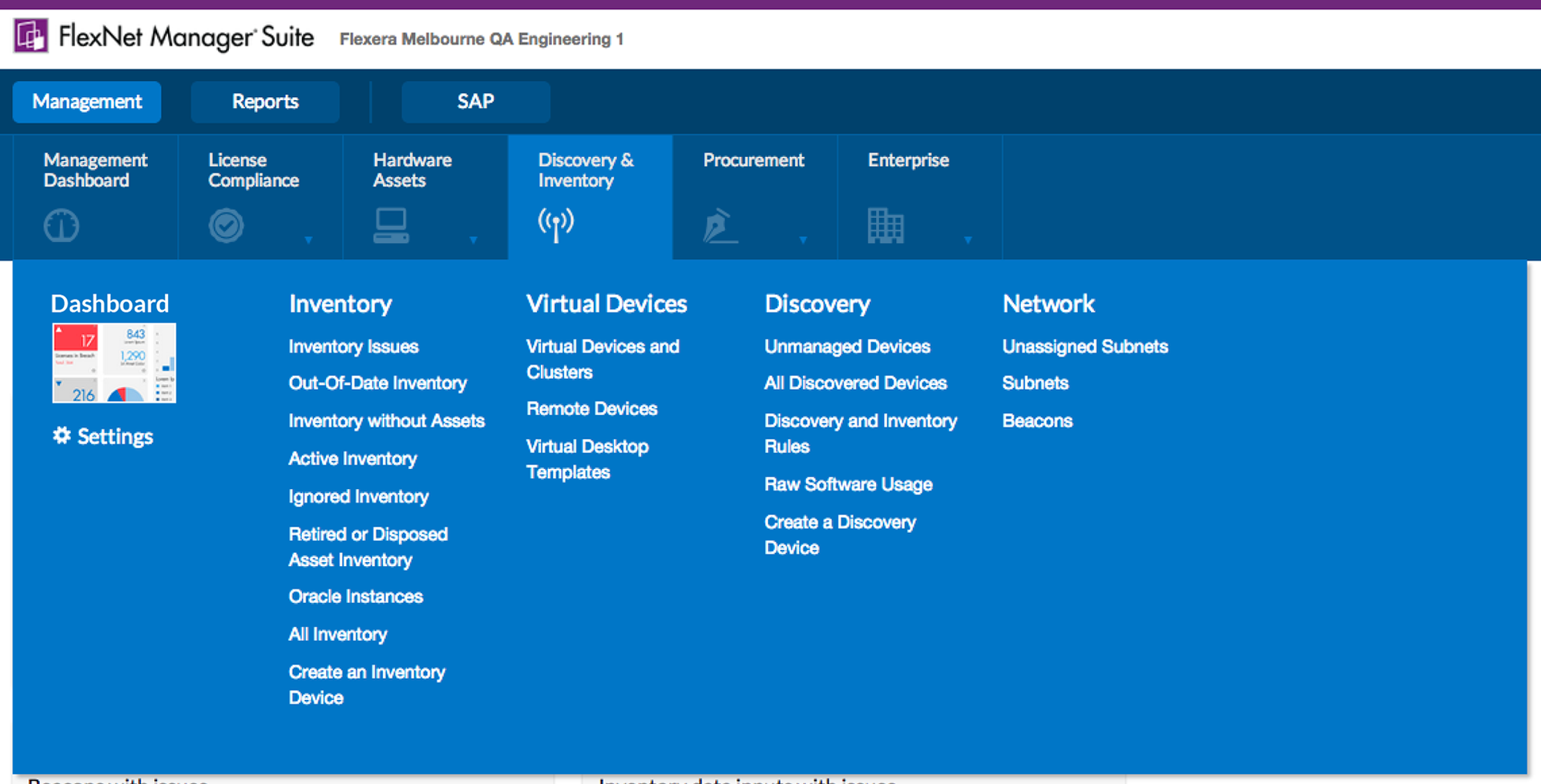
Navigation
The navigation was largely topic-based, to be used by five personas, focussing on three distinct business functions.
-
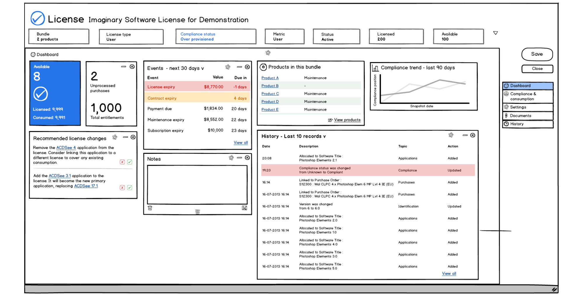
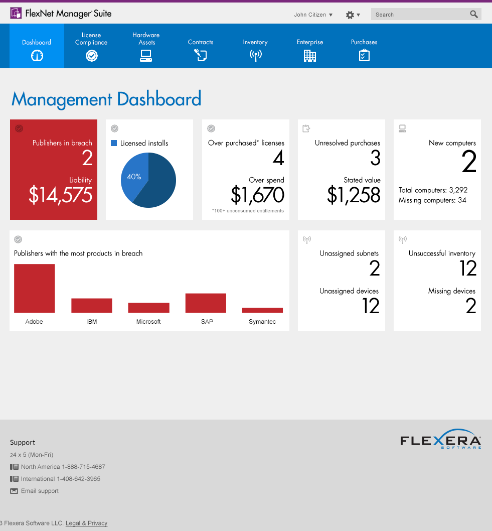
Wireframes
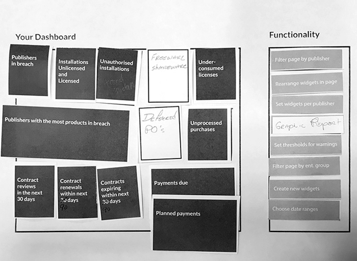
Moving to a web UI was a chance to accentuate the most useful information in the app. I wireframed the principal page types, emphasizing status, summary data, and filtering.
-
GUI Design
I designed three variant directions for the GUI and applied them to a dashboard, a grid, and a form, giving the team a way to select one cohesive option.
-
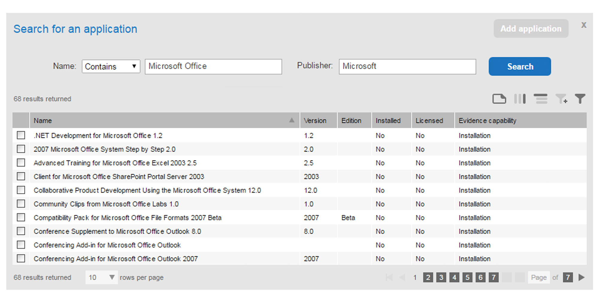
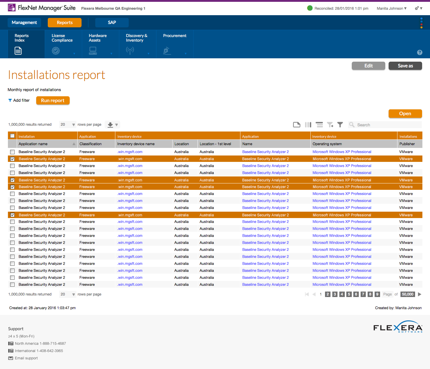
Components
I helped the Engineering team choose a UI component set and designed and specified alterations or bespoke ones.
Improvements and new features
Once the web UI was established, we shifted into a business-as-usual mode; constantly adding new license types while designing features like dashboards, reporting and analytics.
Ongoing approach to UX
In a team of forty to eighty Engineers with two to five Product Managers, the volume of work being done at any one time was large, so it was important to focus on the opportunities that would give users the greatest benefits and optimise the use of our one (sometimes one and a half) UX resources.
Sharing UX with Engineers
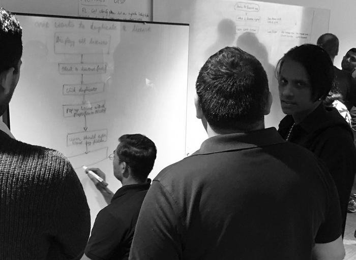
I conducted workflow modelling training with at least one volunteer from each dev team, then they did look ahead modelling for their team and I reviewed it.
I adopted a lifecycle similar to Lean UX that worked with Agile sprints.
User Testing
When new features didn't use established paradigms, I did in-person or remote moderated user testing where customers tested the UIs by using low fidelity prototypes.
We also began to do user testing post-release as part of the Agile process.
User Research
We used the results of a user survey with eighty-five respondents to choose the topics of further research. Then we did face-to-face qualitative research sessions to identify areas of frustration and collect ideas.
We also used entertaining sorting and prioritising tasks to understand and illustrate our users' preferences for new features.